Image View
Image view is the Design Element to display an Image or an Image Asset.
Image Views do not support actions, so users cannot interact/click on them. In order to add actions to an image, you will need to use a Button, or add an Image View as a subview to a Tappable View and then connect their Events.
Image View
Image Asset
The static Image Asset to be displayed by the Image View.
View
Alpha
Alpha is a number that alters the transparency of the image view. It ranges between 0.0 and 1.0, where 0.0 makes the Image View totally transparent and 1.0 totally opaque.
Default value: 1.0
Background Color
Image view’s background color.
The background color will be visible only if there is no Image set or at the transparent area of a transparent image.
Tip: Delete background color to make the Image View transparent.
Content Mode
Content Mode determines how the Image will be scaled and stretched in the bounds of the Image View.
Available Values:
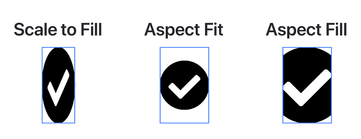
- Scale to fill: The Image will be scaled and stretched to fill the whole Image View without maintaining the Image’s aspect ratio.
- Aspect Fit: The Image will scale and maintain its aspect ratio until one of its dimensions fit in the Image View. The remaining area of the Image View will display the Background Color.
- Aspect Fill: The Image will scale and maintain its aspect ratio until the whole Image View is filled with image content. Note: Part of the Image will not be visible if Masks to Bounds is enabled.
- Center: Image view will center the Image to its bounds, keeping the Image’s proportions the same.
- Top: Image view will center the Image aligned at the top in its bounds.
- Bottom: Image view will center the Image aligned at the bottom in its bounds.
- Left: Image view will align the Image on its left.
- Right: Image view will align the Image on its right.
- Top Left: Image view will align the Image in its top-left corner.
- Top Right: Image view will align the Image in its top-right corner.
- Bottom Left: Image view will align the Image in its bottom-left corner.
- Bottom Right: Image view will align the Image in its bottom-right corner.
Default value: Aspect Fit
Hidden
If enabled, it hides the image view.
Masks to Bounds
When enabled, Image View will clip the Image when it is out of the Image View bounds.
Note: You will need to use the Aspect Fill Content Mode.
Border
Border Color
The color of the border.
Border Width
The width of the border.
Default value: 0
Corner radius
The radius drawn to the corners of the border.
Tip: Enable Masks to Bounds for the content of the image view to be clipped to the rounded corners.
Default value: 0
Shadow
Shadow Color
The color of the shadow.
Tip: You can add opacity/alpha to the Shadow Color in order to add transparency to the shadow.
Shadow Blur
The blur radius used to render the shadow.
Shadow X Offset
The horizontal offset of the shadow.
Shadow Y Offset
The vertical offset of the shadow.
Code
Display Name
You can use this text to identify the Image View in the Code Blocks Editor and in the List of the Screen’s elements. It is not visible to the users.
Visible In Code
It makes the Image View visible in the Code Blocks Editor in order to connect it to other Code Blocks.