Text Field
Text Field is the Design Element to use when need the user to input some text in one line.
Text Field supports only one line text and has extra properties like border style and secure text compared to Text View that supports multi line text input but has no extra properties.
Text Field Properties
Text
The default text that will be initially displayed in the text field when loaded. The user can clear or edit it.
Note: Usually, you will leave this field empty to display the placeholder.
Text Color
The text color of the text.
Font
The font of the text.
Placeholder
The text that is displayed when the Text Field has no (text. The user cannot edit it, and it will hide automatically when the user types the first character.
Tip: Use placeholder to give instructions to your users. For example, if you want the user to provide you with its e-mail, place as placeholder the “Provide us with your e-mail”.
Placeholder Color
The color of the placeholder text.
Note: If placeholder color is not provided, the text color with opacity will be used.
Default value: No color
Text alignment
Indicated how the text is aligned horizontally in the Text Field.
Return Key Type
The default text of the keyboard’s return key. Each selection changes the appearance of the return key.
Available values: Return, Go, Google, Join, Next, Route, Search, Send, Yahoo, Done, Emergency Call, Continue
Default Value: Return
Autocapitalization Type
The capitalization style which is applied automatically to the text as the user types it.
Available values: None, Words, Sentences, All Characters
Default value: Sentences
Keyboard Type
Keyboard Type property sets the keyboard type displayed when the text field is active. The operating system and device can override this option.
Secure text entry
If enabled, the text is displayed as asterisks and cannot be copied.
Tip:This is useful for password inputs.
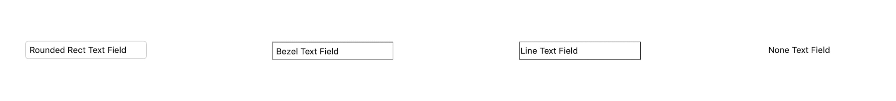
Border Style
Border Style has some standard native iOS border styles drawn around the editable text region.
Tip: You can choose either from these styles or select None and define your border from the border section.
Available values: None, Line, Bezel, Rounded Rect
Default value: Rounded Rect
View
Alpha
Alpha is a number that alters the transparency of the text field. It ranges between 0.0 and 1.0, where 0.0 makes the Text Field totally transparent and 1.0 totally opaque.
Default value: 1.0
Background Color
Text field’s background color.
User Interaction Enabled
User Interaction Enabled indicates whether the user can edit the text field.
Hidden
If enabled, it hides the text field and all of the design elements inside of it.
Border
Text field provides a variety of default borders styles. You can set the following properties for a custom border after setting None the border style.
Border Color
The color of the border.
Border Width
The width of the border.
Default value: 0
Corner radius
The radius drawn to the corners of the border.
Tip: Enable Masks to Bounds for the content of the text field to be clipped to the rounded corners.
Default value: 0
Shadow
Shadow Color
The color of the shadow.
Tip: You can add opacity/alpha to the Shadow Color in order to add transparency to the shadow.
Shadow Blur
The blur radius used to render the shadow.
Shadow X Offset
The horizontal offset of the shadow.
Shadow Y Offset
The vertical offset of the shadow.
Code
Display Name
You can use this text to identify the Text Field in the Code Blocks Editor and in the List of the Screen’s elements. It is not visible to the users.
Visible In Code
It makes the Text Field visible in the Code Blocks Editor in order to connect it to other Code Blocks.